Tuesday, 31 July 2012
Painting...
Attempting photography...
Paper folding...
I was very apprehensive about starting to create a '5 petal flower' as it was said to be more difficult than the 'star wreath'. After a long time has passed and the repetitive moves had been complete, the assemblement I find is the most difficult part of the process. Once this was completed, it looked great, however keeping it's structure was proven difficult as each time it was moved it kept coming undone from the centre. I do love the end result of origami but getting there is a struggle, the 3-dimensional finish is beautiful and gives off a better quality than a 2-d shape
Lucy Affleck...
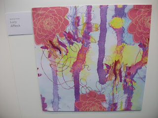
Lucy Affleck's final project in her 3rd year was designed and formed around her chosen theme of 'bedroom interiors', her visual and experimental work was based on plant/human cells which then led onto growing life. Lucy Affleck emphasises on colour using a range of it that varies from light to zesty to dark and richer colours. She created a combination of structured designs with abstract designs, out of the 2 my favourite has to be the abstract designs as they are more free and not particular. I find this aspect of being abstract and free hard to develop in my work, this is what I am trying to develop this summer. In some of her designs it looks like she varies her techniques from print to machinery and combining them together, her use of sewing on the machine is simple stitched drawings of flowers that blend into the design through her use of colour. Lucy Affleck has a very good eye for her choice in colour palettes, her work is stunning and colourful.
Mark-making...
The photograph above was taken at Quay House where MMU 3rd years presented their work. This piece caught my eye through it's use of colour and by the fact it was created through print- one of my favourite areas of study. Using colour in my work has always proved difficult as I always think it makes me work look tacky, cheap and unrealistic but this piece includes none of these aspects. This piece is an experiment that led to a final piece that involved colour and pattern, the patterns created look randomly made and the colour used is subtle. This type of experiment reminds me of watercolour paints blending and merging with areas of water creating subtle yet exquisite detail, almost creating patterns similiar to ones that can be made using marble inks, like my version below created from using just black marble inks.
Monday, 16 July 2012
Marble Inks...Experiment 5...
The Marble Inks this time were printed on an a5 canvas, my expectations of this experiment was that the outcome would be similiar to that of the wooden circles, I couldn't have been more wrong. The inks took to the canvas the way normal inks take to water, they expanded and seeped further into the material rather than sitting on top of it. This experiment works well because of that factor, it creates new depth to using marble inks. The inks on canvas don't sit beside each other, they work with each other creating layers of differing colours.
Marble Inks...Experiments 2/3/4...
The above experiment was created before the one previously shown, however, the size and shape was much larger and the amount of marble ink colours used was less. Marble Inks amaze me print by print, they are always unique. The print above is flat but bursts with life, the colours used work harmoniously together, they blend and twirl into each other creating moveable structure.
The experiment above was mainly about showing the difference in structure of pattern between each marble print, even though the differences are evident the colours deflect this part. I should have stuch to one colour so that the differences between each print was more seeable.
This experiment above was my first marble print done on acetate. My expected results was that the inks would just run of this material but it didn't, in fact the inks printed on the acetate impressively well. I get lost in looking at marble prints. I try to create or re-create shapes and imagery from the patterns that the inks make.
Subscribe to:
Posts (Atom)


